How to Use the MD Biomarker App: A Step-by-Step Guide
DMD biomarkers, Duchenne biomarkers, proteins, mRNA, proteomics, Somascan, Affymetrix, mass spectrometry, TMT, RT-PCR, biomarker database
How to Use the MD Biomarkers Interactive App
Welcome to the MD Biomarkers tutorial. This guide walks you through how to explore, filter, and visualize Duchenne muscular dystrophy (DMD) biomarker data using our interactive web app.
What information is available?
| Category | Specific questions answered | Outputs available | Relevance/Importance |
|---|---|---|---|
| Disease-associated serum biomarker (aka DMD-specific tissue biomarker) | Is a biomarker elevated or depressed in the serum of patients with DMD compared to healthy controls? | Directionality, fold change, raw p-value, adjusted p-value | Drug target screening, diagnosis, monitoring |
| Disease-associated tissue biomarker (aka DMD-specific tissue biomarker) | Is it elevated or depressed in the muscle tissue of patients with DMD compared to healthy controls? | Directionality, fold change, raw p-value, adjusted p-value | Drug target screening, diagnosis, monitoring |
| Pharmacodynamic* response | Does this biomarker respond to (standard of care for DMD) treatment? | Directionality, fold change, raw p-value, adjusted p-value | Drug target screening, monitoring, predictive, monitoring, clinical trial design, prognostic |
| Change over time | Does this biomarker change with age in DMD? How does this compare to what’s known in healthy controls? | Directionality, raw p-value, adjusted p-value | Monitoring, predictive, clinical trial design, prognostic |
| Protein-protein correlations | Which other biomarkers respond similarly in DMD serum to a specific biomarker? | Association strength (biweight midcorrelation) | Building assays for proteins not possible on certain technologies, understanding pathophysiology, pathways, and networks. |
| Association with clinical outcomes | Does this biomarker associate with clinical outcomes? | Association strength (Spearman correlation) | Monitoring, acute change, remote trials and studies, predictive clinical trial design, prognostic, response to treatment |
*Currently, there are only steroid response datasets, but response to other therapies will be added as they become available in the literature.
How is a biomarker defined?
For simplicity, we consider a biomarker as a marker of biological activity associated with a UniProt ID and Entrez Gene ID. This means that fragments which originate from the same protein or isoforms which have the same IDs are grouped together in our compilation.
If the technology used to quantify the biomarker signal provided different target names for these, and that data was available to us (sometimes, Supplemental Material of published papers does not have this information), this was used, and is present to allow for discerning the different targets. Consider the example of Complement C3. There are many fragments of C3, including C3a, C3b, C3d, iC3b, and C3adesarg. These all share the same UniProt and EntrezGene ID and are therefore grouped together.
When multiple aptamers (e.g., Somalogic) or probes (e.g., Affymetrix panels) were used, but they had the same target name, these were used interchangeably, but all individual signals were retained and provided (rather than aggregating them together in some form). The idea here is that some of the aptamers, or probes may be more or less effective given the properties of the serum sample and the biomarker target. What are the implications of this? The website provides the number of significant findings for various associations, such as association with DMD vs healthy controls. In the Overview Table (Section 5), you will see the fraction of the number of significant results across all aggregated results under a Uniprot ID.
MD Biomarker App
Click on Visualization and Interactive Biomarker App from the dropdown (Biomarker Database Visualization App).
There are two tabs in the app, as shown in Figure 1: Overview table (Section 5) and biomarker-specific details.

Overview table of Shiny app
Caution: Multiple fragments of biomarker target may be included in search results; please do not make conclusions based on overview table only.
The purpose of this tab is for searching for your biomarker of interest and getting a quick summary of the findings for that biomarker. Figure 2 shows the first 5 rows of the searchable table.
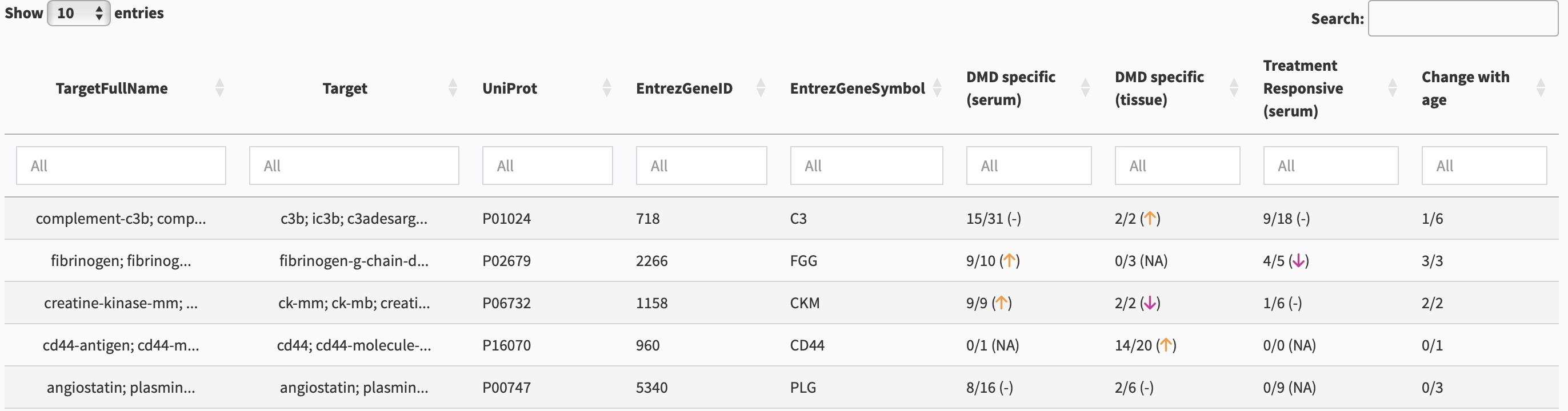
There are multiple columns for identification including TargetFullName, Target, UniProt, EntrezGeneID, and EntrezGeneSymbol. Each of these columns is searchable using the white box below the column names.
Searching for a single biomarker
Suppose we want to search for MDC. If we enter “MDC” in the Target column, we will get multiple results, as shown in Figure 3. We could have used the full name of the biomarker in the TargetFullName search box: “macrophage-derived chemokine.”
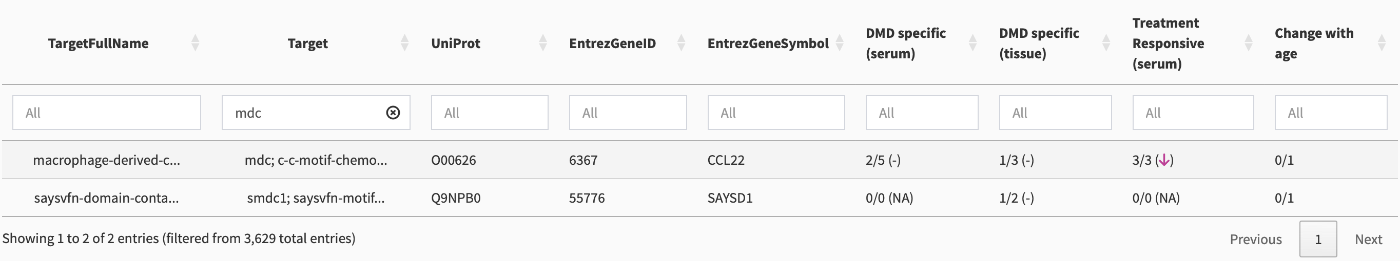
A more flexible method for searching is to use the overall search column. If we enter “MDC” there, as shown in Figure 4, we get multiple results due to partial matching.
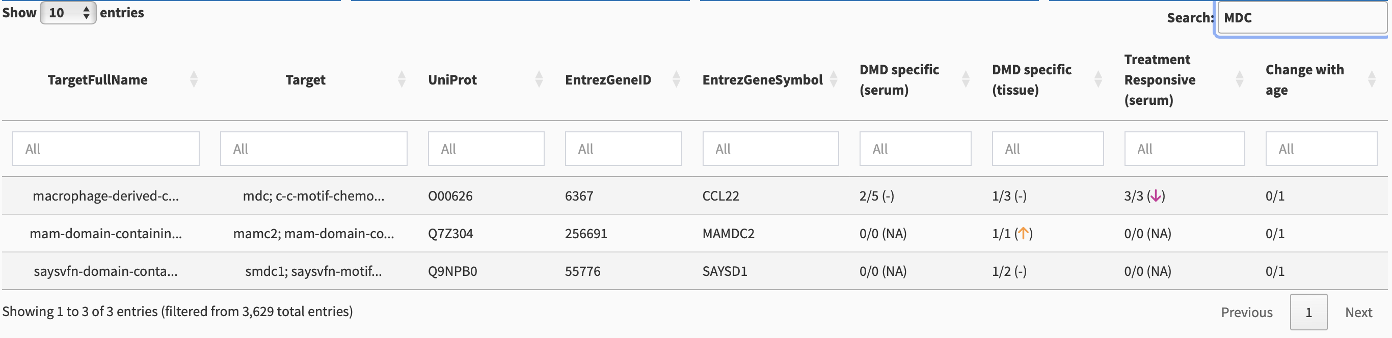
Multiple target names can occur due to there being multiple fragments from a single protein, or different naming conventions from different datasets combined together. Because the first entry contains mdc as one of the target names, it is the desired entry. We single-click on this entry to show biomarker-specific details (Section 3).
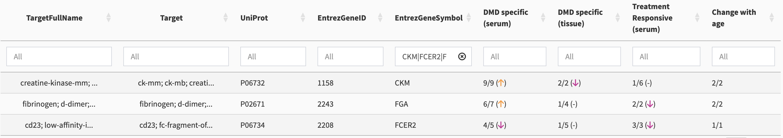
Comparing multiple biomarkers in the Overview table
Using an “OR” symbol, i.e., using “|”, multiple biomarkers can be compared in the overview table. For example, in the search box under the EntrezGeneSymbol column, put in CKM|TTN|FGG, and a comparative overview shows (see Figure 5)
Association Summaries
The last few columns, as shown in Figure 2, provide the number of significant findings for multiple associations:
- DMD specific (serum) - is this biomarker elevated or depressed in serum of patients with DMD compared to healthy controls?
- DMD specific (tissue) - is this biomarker elevated or depressed in tissue of patients with DMD compared to healthy controls?
- Treatment responsive - does this biomarker respond to treatment?
- Change with age - does this biomarker change with age?
In cases where there are no fragments or isoforms of the protein in the merged dataset (ex. neuropilin-2), the fractions provided in the table reflect the consistency of getting a significant finding across different measurements methods (including different aptamers, probes, etc.), and the reproducibility of getting the same significance for a given measurement method, based on adjusted p-values used across different studies. In cases where there are different targets/fragments under a single UniProt ID, some fragments may have strong associations and others may not, but these results will be combined into a single fraction (see Section 3). To get a detailed picture, you will need to select the protein by single-clicking on a row and going to the Biomarker-specific details tab (Section 6) to understand the details. We do not recommend doing screening based on the overview table only.
Selecting a biomarker from the table
To get more information on a biomarker, single-click on that row in the table. This will bring you to the biomarker-specific details tab.
Biomarker-specific details
At the top of the page is a drop-down list of all biomarkers. This provides another method for searching the database. By default, the first entry of the sorted dataset is listed in this search bar. You can click this search bar, delete what is already in the search bar with a backspace, then start typing the name of your favourite biomarker to see the list of possible options. Click on the one you are interested in, and then click search on the right hand side. Note that the label used in this search bar combines the target full name(s), the target ID(s), the UniProt ID, and the Entrez Gene ID.
Direct links for UniProt, QuickGO, and Human Protein Atlas annotations for the selected biomarker are provided near the top of the page.
Download HTML report
Near the top right of the Shiny app, click on “Download Report” and then “Biomarker-specific” to download an HTML report of the information available through the Shiny app.
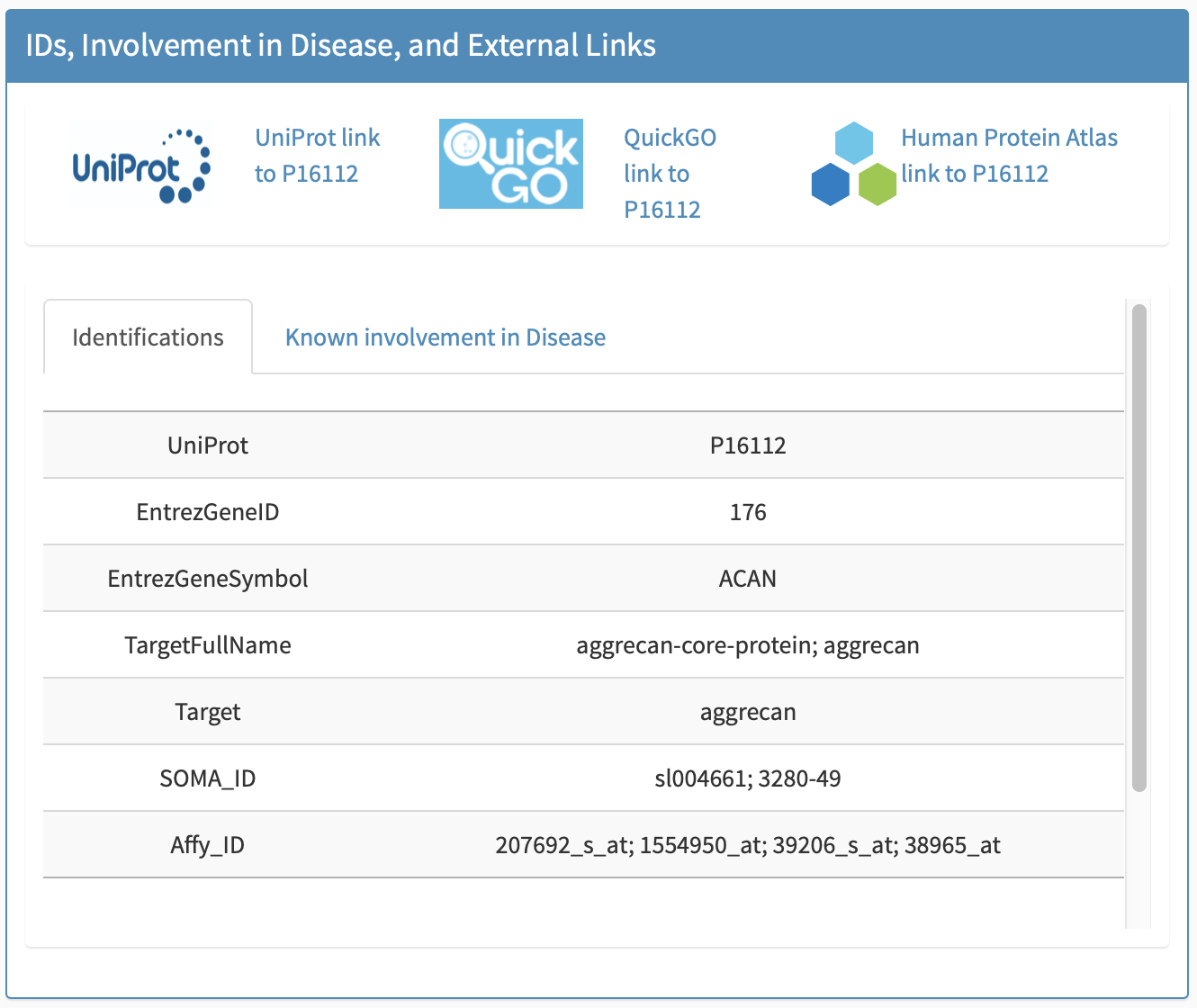
All identifications
All identifications including UniProt, EntrezGeneID, EntrezGeneSymbol, and TargetFullName, Target, Somalogic/Somascan IDs, and Affymetrix probe IDs are provided in this subpanel, e.g., Figure 6.
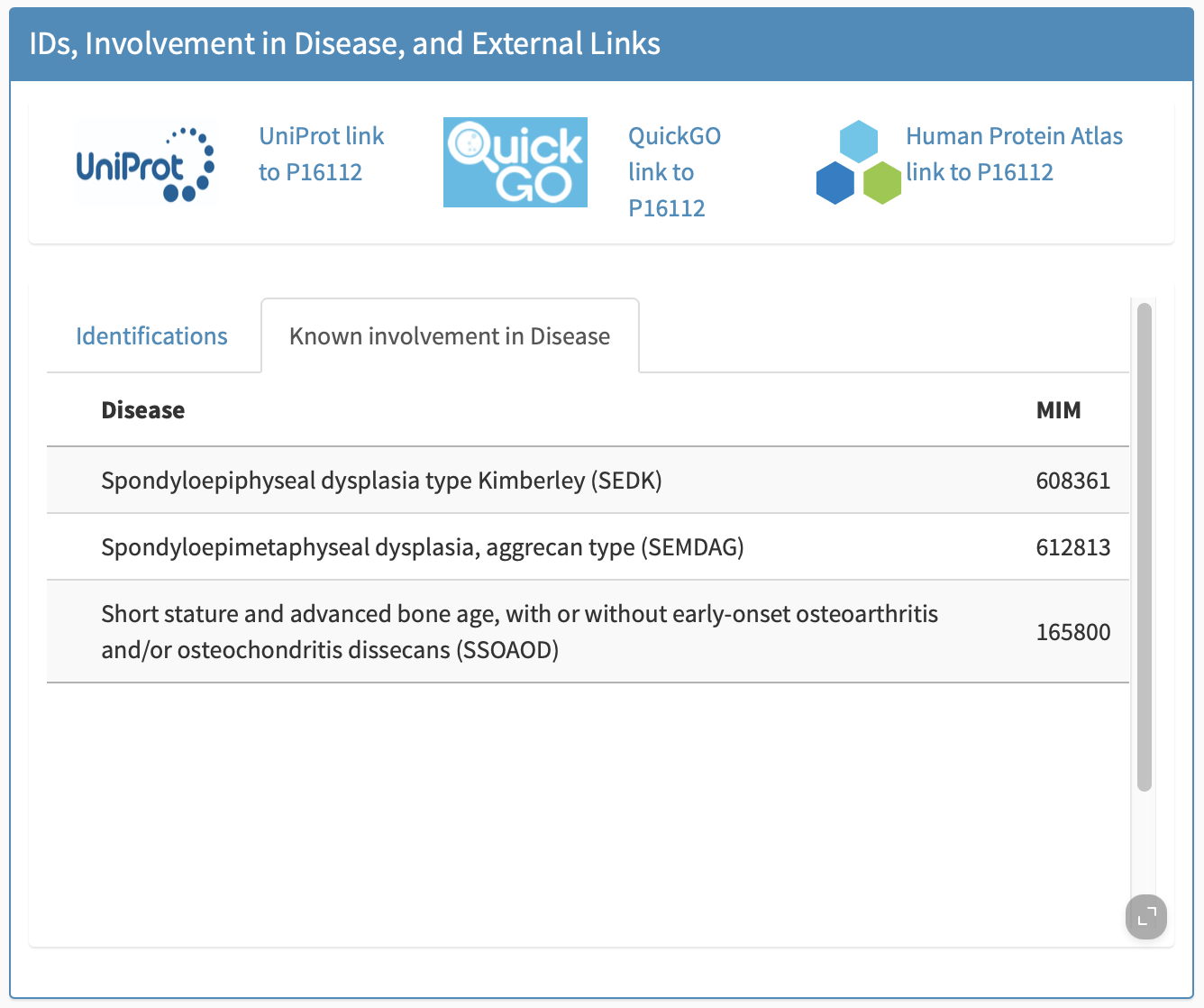
Known involvement in disease
Known involvement of the biomarker in disease generally (not necessarily muscle disease) is provided in this subpanel, e.g., Figure 7.
The rest of this biomarker-specific view is a series of panels, discussed below.
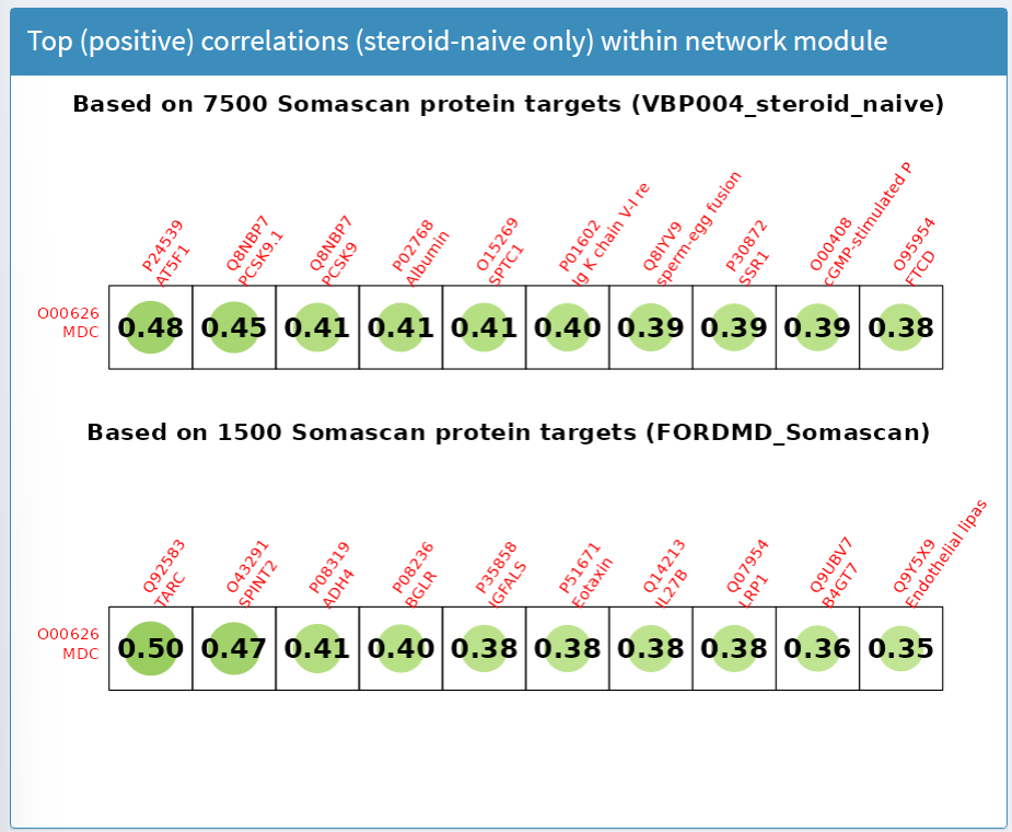
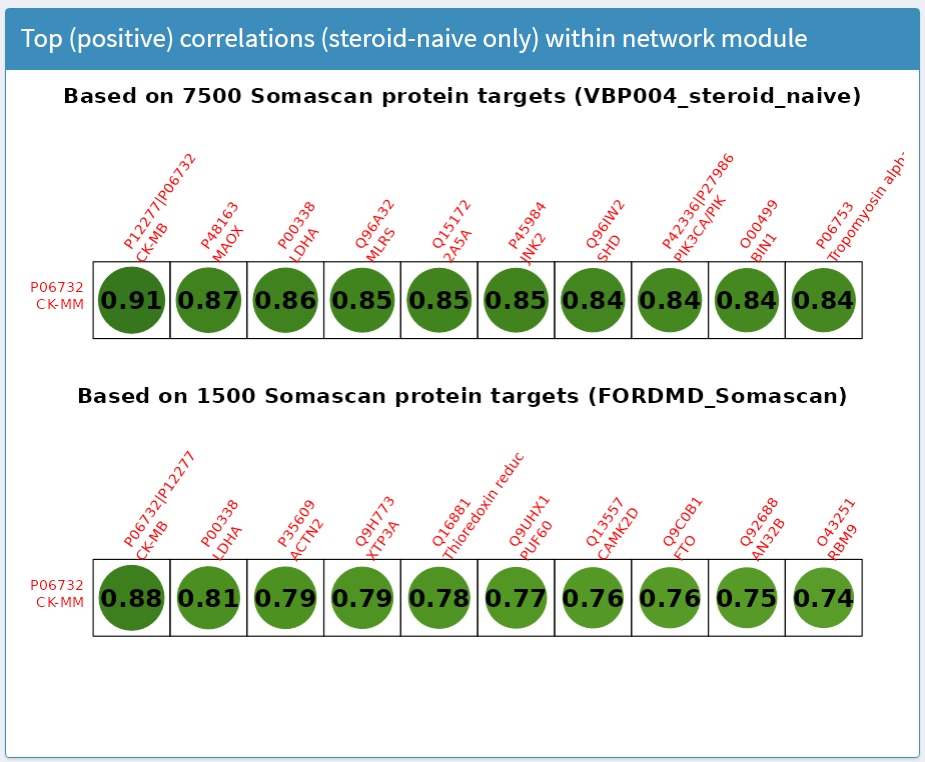
Top (positive) correlations (steroid-naive only) within network module panel
The results in this panel use data subsets from a clinical trial in young (4 to <8 years) treatment-naive boys. Weighted correlation network analysis was applied to biomarker concentrations at baseline measured by SOMAscan to create hierarchical clusters (called network modules) of biomarkers with similar responses. For the selected biomarker (row), the top 10 highest correlations with other biomarkers (columns) within the network module are presented, as shown in Figure 8. Labels provide the UniProt ID and target name.
DMD vs Healthy Controls (serum; Protein target)
The panel DMD vs Healthy Controls (serum; Protein target) shows results comparing proteins measured in serum of patients with DMD compared to healthy controls. An overall summary is available at the top of the panel, showing the fraction of statistically significant findings across the datasets compiled for this biomarker and the directionality in the majority of the biomarkers at baseline vs controls, and how this responds to treatment. This is the same as what the overview page had provided. For example, for IGFBP3, it shows that IGFBP3 is lower in serum of DMD vs healthy controls based on 4 out of 6 significant findings and increases in serum on treatment with steroids based on 3 significant findings.
There are two views for these panels: plot view (default) and table view.
The plot view shows a volcano plot in which the -log10 of the adjusted p-value is plotted against the log2 of the foldchange, as shown in Figure 9. Statistically significant datapoints (above the dotted line) are coloured orange and non-significant are coloured blue. Different shapes are used for different technologies (circle for SOMAscan, triangle for TMT). Hovering over the datapoint will prompt a mouseover/tooltip that indicates the citation, the target ID, the age range of the cohort, the technology used to measure the biomarker, the fold change of that protein in DMD compared to healthy controls, and the adjusted p-value of the comparison. The age range can be filtered; in the plot below, the age range was restricted to upper bound of 12 years for the samples from which data is being summarized.
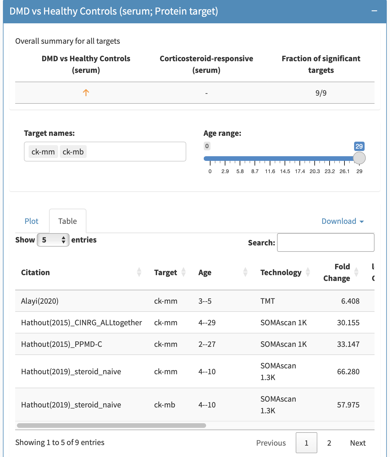
By clicking on Table, the information can be obtained in a tabular format including p-values, fold changes, etc. This table can be filtered in the searchbox as well. Both the figures and tables allow for exporting the compiled findings from a subpanel. To export the figure, either take a screenshot, or when hovering over the figure, click the camera button to export the figure as a png plot. To export the table, click the Download button in the subpanel to export to either an Excel or CSV format.
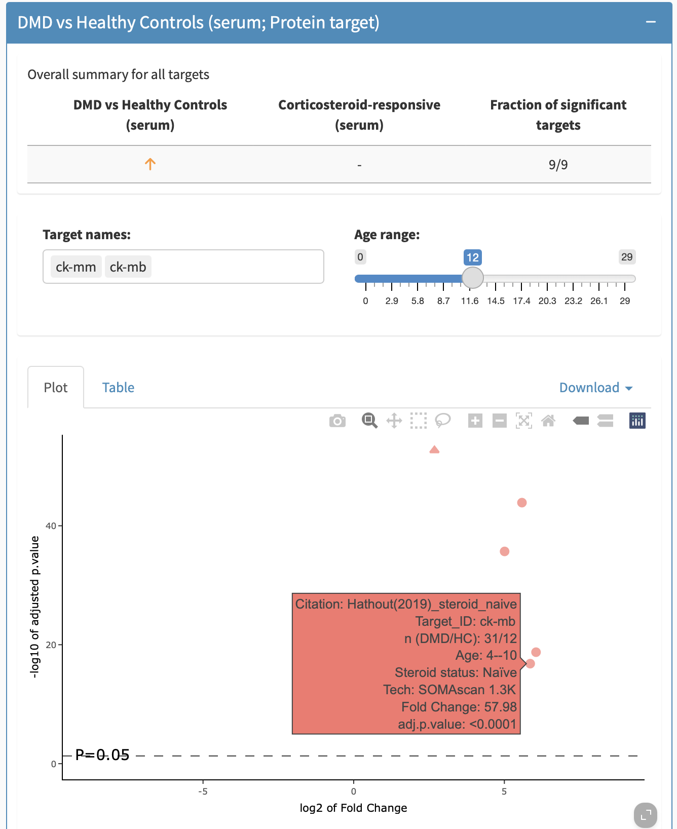
For biomarkers in which multiple fragments are grouped together (e.g., Complement C3), the tooltip will allow you to distinguish between different targets. The target can be filtered by removing or adding back in specific targets.
DMD vs Healthy Controls (tissue; mRNA target)
The panel DMD vs Healthy Controls (tissue; mRNA target) shows results comparing proteins measured in tissue of patients with DMD compared to healthy controls. The features described above also apply to the DMD vs Healthy Controls (tissue; mRNA target) panel.
Treatment-responsive (serum; Protein target) panel
The panel Treatment-responsive (serum; Protein target) shows proteins measured in serum associated with treatment by glucocorticoids. The features described above also apply to the Treatment-responsive (serum; Protein target) panel.
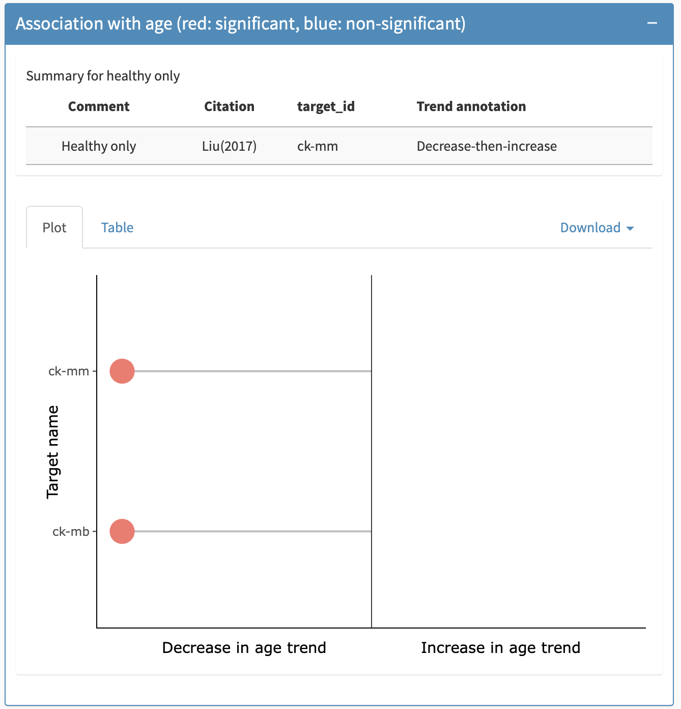
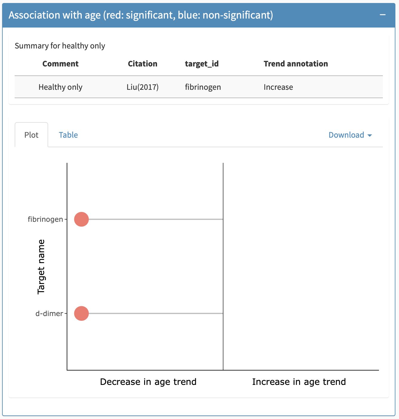
Association with age panel
The association with age panel indicates if the biomarker showed a statistically significant association with age, and what direction the association was. At the top of this panel, when available, there is a table providing information about previously published association with age in unaffected kids, i.e., without DMD. Below this, information on DMD specific associations is provided.There are two views available for this: a plot view (default) and a tabular view, the latter allowing for export of the table (including on healthy unaffected controls) into an excel or csv file. Figure 10 show the plot view for this panel for Creatine Kinase and Fibrinogen respectively.
The colour of the data point indicates the significance of the result, where orange indicates a significant adjusted p-value and blue indicates a non-significant adjusted p-value. The sign of the age association is indicated by which side of the plot the datapoint is on (left being a negative foldchange) as the x-axis label explains. Hovering over the data point will prompt a tooltip that indicates the citation, the target ID, the age range of the cohort, treatment status, the technology used to measure the biomarker, and the adjusted p-value. The table view shows the slope direction (note that modeling techniques varied and, therefore, slopes are not directly comparable across citations), the statistical significance of the finding, the citation from which the result was taken, the technology used to measure the biomarker, the age range of the cohort, the target, the adjusted p-value, and the trend annotation in healthy controls, where available.
In cases where multiple targets are grouped together, these targets are separated along the y-axis.
Association with age panel under the biomarker-specific details tab.
Correlations: biomarker and clinical outcomes (steroid-naïve, 4–8 years)
A correlation matrix is provided. The correlations presented are simply the cross-sectional correlations between biomarker concentrations and a variety of clinical outcomes commonly used in young age in DMD. No significance testing was done. A table view is also possible.